讲解人 · Jamie

原文
One of the earliest was the 18th-century Italian Giambattista Bodoni, whose fonts have conferred on him a kind of immortality.
Like Bodoni, Margaret Calvert has been inducted into the graphic equivalent of Mount Olympus.
Calvert turns 90 this year and—in an extraordinary design and teaching career that began in the late 50s and still continues—has become the embodiment of a national treasure.
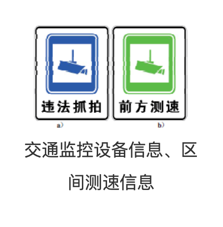
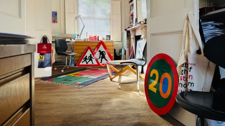
Anyone who has ever driven on a British highway will have encountered the sign system she designed with Jock Kinneir as part of the ambitious postwar modernisation and expansion of the nation’s road network,
unifying and rationalising what had become a confusing and potentially hazardous array of lettering styles, colours and sign layouts.
Lasting from the late 50s to the mid 60s, this was a colossal undertaking, but Calvert and Kinneir’s lucid, legible and eminently elegant signage has attained design-classic status.
Officially implemented in 1965, and largely unchanged, it was “a house style for Britain”, embracing modernity with the aim of making everyday things better for everyone.
Roads are safer, driving more pleasurable.
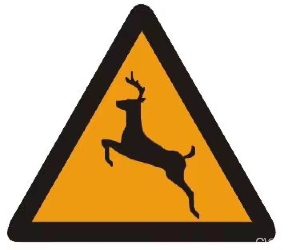
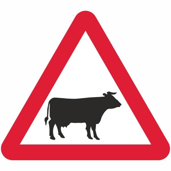
Calvert designed many of the familiar warning pictograms, including the silhouettes of a careering deer and cantering horse, inspired by the pioneering photography of Eadweard Muybridge.
Farm animals are denoted by a static cow, based on a real one named Patience she encountered growing up at a relative’s farm in Wiltshire.
Calvert herself features on the sign for children crossing, as a girl with distinctive bobbed hair leading a small boy across the road, rather than the other way around.
带着问题听讲解
- 如何理解 waddle 这个词?
- 文中提到,最早一批拥有以自己名字命名的字体的平面设计师有谁?
- 英国公路上的标识系统是由哪两位设计师设计的?
讲解
重点词汇
waddle
/ˈwɑː.dəl/
v.(鸭子或企鹅等)摇摇摆摆;(人)摇摇摆摆地行走
- 例句:The baby waddled over to the table with a big toy.
typeface
/ˈtaɪp.feɪs/
n.(印刷或电脑打出来的)字体
- 相关词汇:type(n. 打印或印刷的字)相关词汇:face(n. 脸;面)
confer
/kənˈfɝː/
v. 授予
- 搭配短语:to confer an honorary degree on him搭配短语:to confer sth. on sb.
immortality
/ˌɪm.ɔːrˈtæl.ə.t̬i/
n. 不朽,永生
- 相关词汇:mortal(adj. 凡人的,终有一死的)
- 例句:All men are mortal.
- 反义词:immortal(adj. 永生的)
英文释义:the quality of being able to live or last for ever
induct
/ɪnˈdʌkt/
v. 使入门;使正式就任
- 例句:She was inducted as president of the college.英文释义:to introduce someone formally or with a special ceremony to an organization or group, or to beliefs or ideas例句:My master inducted me into the skills of magic.
Mount Olympus
n. 奥利匹斯山;神之居所(比喻一个领域的圣殿)
embodiment
/ɪmˈbɑː.di.mənt/
n. 化身,体现
- 相关词汇:embody(v. 使具体化,具体表现,体现)
- 词根词缀:em-(使)
- 相关词汇:body(身体)
- 例句:She embodied good sportsmanship on the playing field.
例句:He was the embodiment of the English gentleman.
rationalise
/ˈræʃ.ən.əl.aɪz/
v.(对……)进行合理化改革,使合理化;合理地解释(行为、决定等),为……找出合理的理由
- 相关词汇:rational(adj. 理智的)
- 例句:He was too upset to be rational.
例句:We rationalise the cost by saying that an expensive item would last longer than a cheaper one.(合理地解释)搭配短语:to rationalise the production system(合理化改革)
hazardous
/ˈhæz.ɚ.dəs/
adj. 危险的
- 相关词汇:hazard(n. 危险物)
- 搭配短语:a health hazard
- 搭配短语:a fire hazard
搭配短语:to work in hazardous conditions
colossal
/kəˈlɑː.səl/
adj. 巨大的,庞大的
- 英文释义:extremely large搭配短语:a colossal statue搭配短语:a colossal mistake
undertaking
/ˈʌn.dɚˌteɪ.kɪŋ/
n. 任务,工作
- 相关词汇:undertake(v.(开始)做,从事)例句:The construction of the tunnel is a large and complex undertaking.
lucid
/ˈluː.sɪd/
adj. 清晰的,明了的
- 词根词缀:luc(在拉丁语中表示“光”)英文释义:expressed clearly and easy to understand搭配短语:to write in a clear and lucid style
legible
/ˈledʒ.ə.bəl/
adj.(字迹或者印刷)清楚的,易读的
- 例句:Her handwriting is barely legible.
eminently
/ˈem.ə.nənt.li/
adv. 突出地,明显地
- 相关词汇:eminent(adj. 显赫的,卓越的;突出的,明显的)
- 搭配短语:an eminent historian
signage
/ˈsaɪ.nɪdʒ/
n.(公开展示的一整套)标志,标识
- 相关词汇:sign(n. 标志,标识)
pictogram
/ˈpɪk.tə.ɡræm/
n. 图画文字,象形文字
- 词根词缀:pict-(画)词根词缀:gram(写的东西,记录的东西)
silhouette
/ˌsɪl.əˈwet/
n. 剪影,逆光的轮廓
- 例句:The silhouette of the tree was clear against the winter sky.
career
/kəˈrɪr/
v. 猛冲
- 词性拓展:career(n. 职业,事业)例句:The coach careered down a slope.
canter
/ˈkæn.t̬ɚ/
v.(马)小跑,慢跑
- 相关词汇:Canterbury(坎特伯雷)
denote
/dɪˈnoʊt/
v. 表示,指示
- 例句:The colour yellow is used to denote danger.
拓展阅读